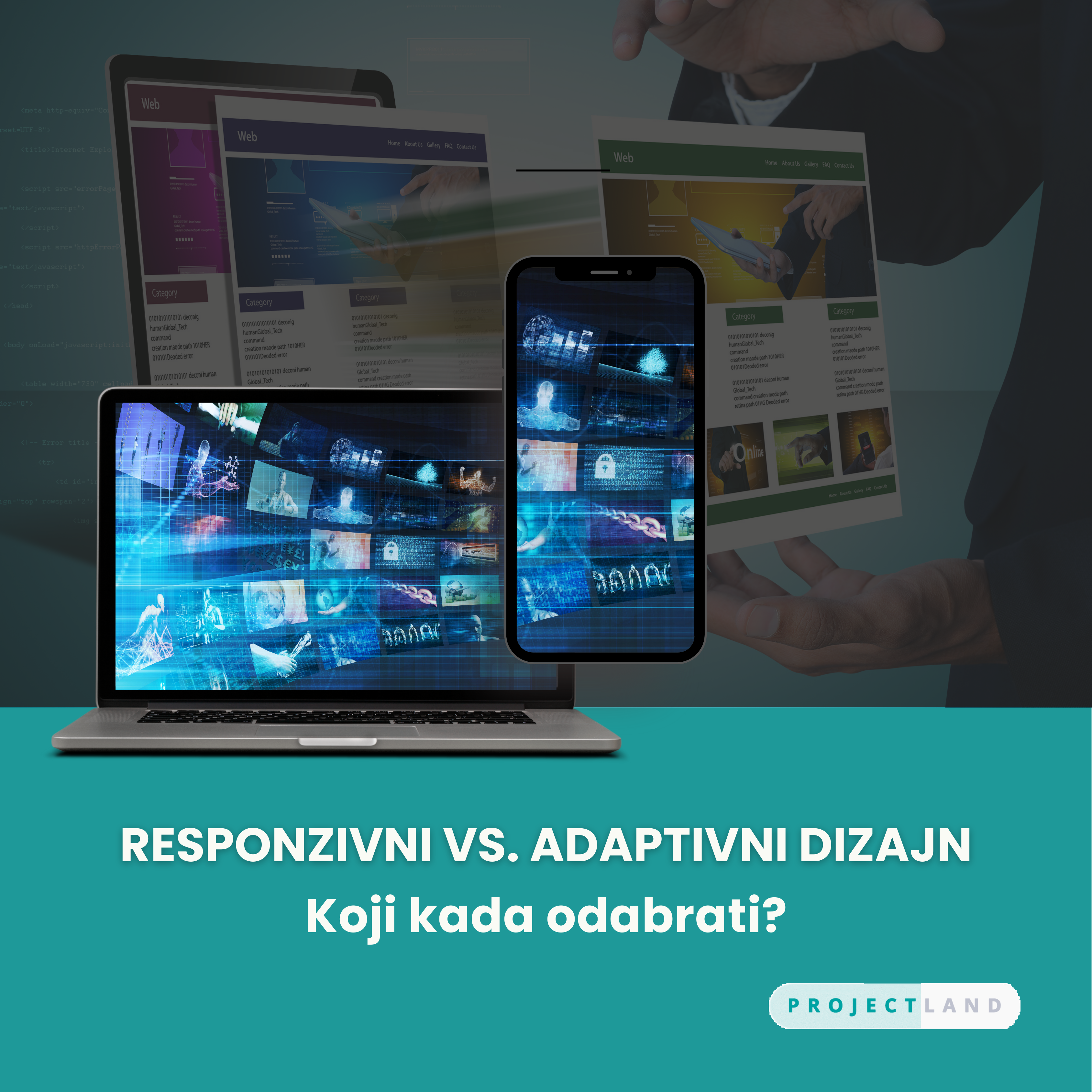
RESPONSIVE VS. ADAPTIVE DESIGN
Responsive design is a concept that focuses on designing a website in a way that fits any device, be it a tablet, laptop or iPhone, in any position: portrait or landscape. The layout and content respond to the device being used through features such as fluid grid, flexible images and CSS media queries. This means that whether the user is accessing the website on a smartphone, tablet or any other device, including a computer monitor, the website will adjust its appearance to fit your screen.
Therefore, the usability and accessibility of the website does not deteriorate on a smaller screen. This flexibility not only improves user satisfaction, but also reduces the workload of website maintenance as a page version is no longer required.
Adaptive design involves the development of several pre-design layouts that are fixed for different categories of devices in order to achieve the best results. Responsive design changes the layout according to the available space, while adaptive design sets layouts for each screen resolution and/or orientation. The servers themselves register the type of device the user is using – smartphone, tablet or desktop – and then deliver the appropriate layout.
This approach allows full control over the look, feel and behavior of a website on any device. Thus, site users see a highly optimized version for the devices they use.
RESPONSIVE VS. ADAPTIVE DESIGN
Flexibility - Responsive design works on the concept of a fluid grid system, which allows layout changes in terms of screen size, orientation, and device density. This kind of flexibility is made possible with the help of CSS media queries that apply styles depending on device characteristics. On the other hand, adaptive design involves establishing precise layouts for ranges of devices belonging to different categories. These layouts are optimized to work with specific screen sizes so that user interaction with the device is perfect. The adaptive approach is more customized, but results in managing multiple code bases.
Scalability - Responsive design is more scalable. Responsive design adapts the appearance of the website to the device's screen size, which can be especially useful for a website that must work well on several devices, from smartphones to desktop computers. Adaptive design, on the other hand, works best in situations where specific devices must be identified for a far superior experience.
For example, an online store website that receives a lot of traffic from mobile devices will find a responsive design that provides a faster and more personalized mobile shopping experience.
Speed - Responsive design is usually faster to design and more affordable to update than a site developed for specific devices. However, it is not as optimized for performance on every device, which can be a drawback. Adaptive design is therefore likely to take a little more time to implement because the designer has to create more layouts, but the result is better performance on key devices.
Advantages of Responsive Design
Efficiency - When designers and developers create a single layout that can accommodate different screen sizes and orientations, it becomes very easy to develop layouts. Instead of designing several layouts for different devices, responsive design makes it possible to create a single code that is used and managed.
Consistency - There is a layout that changes the design depending on the device screen size, but the content looks the same on all devices. This aspect is essential for branding and usability as it helps establish a clear correlation between the design, structure and presentation of content on mobile and web devices.
Advantages of adaptive design
Optimization - Since numerous fixed layouts have been developed to suit different devices, each of them can be optimized down to the smallest detail. This approach allows designers to anticipate multiple aspects of different devices and their limitations.
Faster load times - Because the server is aware of the type of device accessing the site and can only send the code and resources needed for that particular layout, the overall page size is small and so is the page load time. In addition to improving ease of use, faster load times are also a boon for SEO as they are an essential factor that affects website rankings.
Which one to choose?
The choice of design is certainly determined by the project itself, i.e. factors such as audience and price. If you expect a large number of people on your website on all devices while simultaneously using the same version of the site, then a responsive site will suit your needs better.
However, if your project requires refined optimization for specific devices and the goal is to provide users with a unique customized experience enhanced by specific device features, and you are willing to manage an increased degree of complexity and adaptability, then choosing an adaptive site will be preferable.
When to use responsive design?
New Sites: Responsive design shines when you're building a site from scratch. It ensures a consistent experience across devices.
Large sites: Projects with multiple pages benefit from a single codebase and efficient development.
When to use adaptive design?
Improvements and redesigns: Responsive design suits smaller projects where existing content needs optimization.
Faster Loading: Responsive layouts load faster due to targeted code delivery.
In the end, the decision to use one or another method for creating a web page depends on the general concept and goals of the web project.
Source: https://hypersense-software.com/blog/2024/07/17/responsive-vs-adaptive-web-design-strategies/?utm_source=techpulse-nl&utm_medium=email , August 2024